B. Drama / D. Visual Arts · Drama and Visual ArtsVisual Arts: Analogous, Transparent and Digital Colour
D1.1 D1.3 D2.1About 50 minutes
Learning goals- I can use an analogous colour scheme to create harmony and mood.
- I can create transparent colour with watercolour washes, glazing or tissue paper.
- I can explain the RGB colour model (light, for screens) and the CMYK model (ink, for printing).
- I can create art with traditional materials and current media technologies to express feelings and ideas.
- I can interpret the feelings and themes that colour helps communicate in an art work.
Words to know
analogous colours
Colours next to each other on the colour wheel, like blue, blue-green and green.
dominant colour
The colour used the most in an art work, which sets its main mood.
accent colour
A small amount of a contrasting colour that draws attention.
transparent
See-through. Transparent colour lets the paper or colours underneath show through.
wash
A thin layer of watery paint spread over an area.
glazing
Painting a thin transparent layer of colour over a dry layer, so the two colours mix in the viewer's eye.
decoupage
Gluing layers of paper (such as tissue paper) onto a surface and sealing them.
RGB
Red, Green, Blue: the colours of light that screens mix to make every colour. All three together make white.
CMYK
Cyan, Magenta, Yellow and Key (black): the ink colours printers use. Cyan, magenta and yellow together make a very dark colour; black ink is added for true black.
Remember from Grade 6
You filled in the 12-hue colour wheel with tertiary colours, used analogous colours (neighbours on the wheel), and chose between naturalistic and expressive colour.
In Grade 7 you will use analogous colour schemes with more control, create transparent colour with watercolour and tissue paper, and explore how colour works in digital media, on screens and in print.
Why does my picture look different printed?
Have you ever made something bright on a screen, printed it, and found the colours looked duller? That's not a mistake by the printer. Screens and paper make colour in completely different ways. Screens glow with light. Paper reflects light, and ink soaks up some of it.
Today's artists work with both traditional materials (paint, paper, ink) and current media technologies (digital drawing apps, photo editing, animation, video). Knowing how colour behaves in each one helps you get the result you want.
Analogous colour schemes: harmony and mood
Analogous colours are neighbours on the wheel, so they share a colour. Blue, blue-green and green all contain blue. That's why analogous schemes feel harmonious (they "get along").
Tips for using them:
- Choose three to five neighbours. Pick one as the dominant colour and use the others in smaller amounts.
- Vary the values (light and dark) so the picture isn't flat.
- For extra punch, add a small accent of the complementary colour. A tiny red-orange canoe on a blue-green lake really pops.
Mood: warm analogous schemes (yellow, yellow-orange, orange, red-orange) can feel cozy, energetic or hot. Cool ones (green, blue-green, blue, blue-violet) can feel calm, cold or sad.
Transparent colour
Watercolour is transparent: the white paper glows through the paint. That's why watercolourists usually save white areas by not painting them, instead of using white paint.
- Wash: a thin, watery layer over a big area, like a sky.
- Wet-on-wet: paint onto damp paper. Colours spread and blend softly, great for clouds, fog and northern lights.
- Glazing: let one layer dry, then paint a thin transparent layer of another colour on top. Blue over dry yellow looks green. Glazing builds rich, glowing colour.
Tissue paper decoupage: tear or cut coloured tissue paper and glue it in layers with watered-down white glue (or decoupage medium), brushed on top and underneath. Where tissues overlap, new colours appear, just like glazing. Some coloured tissue bleeds its dye when wet, which can make interesting effects, so test a scrap first.
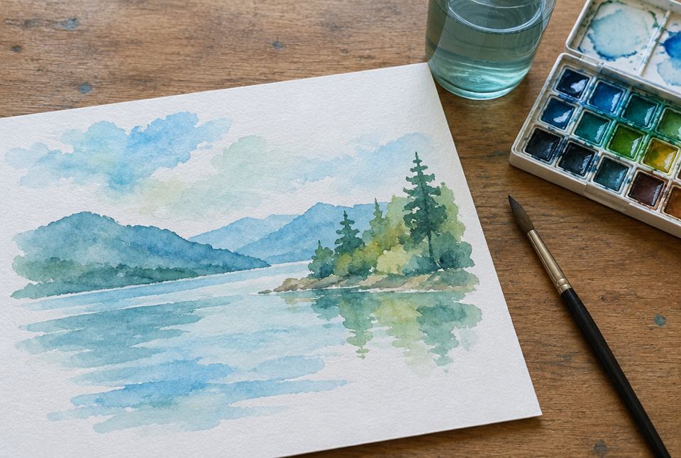 This painting uses an analogous scheme of blue, blue-green and green. The transparent washes let the white paper glow through. AI-generated image
Colour in digital media: RGB and CMYK
RGB (light): every screen pixel has tiny red, green and blue lights. Mixing light is additive: the more light you add, the brighter it gets.
- red + green = yellow
- green + blue = cyan (bright blue-green)
- red + blue = magenta (bright pink-violet)
- red + green + blue = white
In many apps, each RGB light has a number from 0 to 255. For example, red 255, green 0, blue 0 is pure bright red.
CMYK (ink): printers use cyan, magenta, yellow and K for key, which is black. Ink works by absorbing (subtracting) light, so mixing inks makes colours darker. Cyan + magenta + yellow makes a muddy dark colour, so printers add black ink for crisp blacks and text.
Why it matters: some very bright screen colours (like glowing greens and blues) can't be printed exactly with ink, so they look duller on paper. If your art will be printed, check the colours on a test print.
Worked exampleExample: An analogous watercolour of a northern lake
Let's plan a calm painting of a lake at dusk with an analogous scheme and transparent colour.
- Scheme: blue-violet, blue, blue-green and green. Dominant colour: blue.
- Wet-on-wet sky: wet the top of the paper and drop in blue and blue-violet so they blend softly.
- Save the whites: leave a thin strip of paper unpainted for the light reflecting on the water.
- Glazing the trees: when the sky is dry, paint the far shoreline in a pale blue-green. When that's dry, glaze darker green over the near trees so they look closer.
- Accent: a tiny orange dot for a campfire on the shore (orange is blue's complement).
- Interpret: the cool analogous colours feel calm and quiet; the small orange campfire suggests warmth and people in the stillness.
An analogous scheme creates harmony and mood; transparent layers make the colour glow; a small complementary accent creates a focal point.
Worked exampleExample: From screen to print
Ayesha designs a poster on a tablet for her school's Earth Day fundraiser. It will be printed and also shared on the school's website.
- On screen (RGB): she uses a glowing bright green background and white letters. It looks amazing on the tablet.
- Test print (CMYK): the green prints darker and duller, and the poster loses some energy.
- Solve the design challenge: she picks a slightly less intense yellow-green that prints well, and makes the letters a dark blue-green with a white outline for contrast.
- Two versions: she keeps the bright RGB version for the website and saves the adjusted version for printing.
- Technology tip: she uses the app's layer opacity slider to make a transparent leaf pattern behind the words, like a digital glaze.
Knowing that screens use RGB light and printers use CMYK ink helps artists plan colour for each medium and audience.
Just for funFunny but true: cyan, magenta and yellow ink mixed together make a muddy dark colour, not a crisp black. So printers keep a separate black ink, the K in CMYK. Even printers know when to call for backup.
Safety and care
- Use washable, non-toxic paints and glue. Cover the table.
- Coloured tissue dye can stain hands and clothes: wear old clothes and wash up after.
- Ask a grown-up before downloading any drawing app, and use free, kid-appropriate ones.
- Take screen breaks: look away at something far away every 20 minutes or so.
Hands-on activityLight, ink and water
You need: watercolour paints (or watered-down washable paint), a brush, water, paper (thicker paper if possible), coloured tissue paper, white glue mixed with a little water, and (optional, with permission) a tablet or computer with a free drawing app.
- Glaze test: paint a yellow stripe and let it dry. Paint a blue stripe across it. What colour appears where they cross? Try two more pairs.
- Wet-on-wet: wet a square of paper, then drop in two analogous colours. Watch them blend.
- Analogous painting: choose three or four neighbours on the wheel and one dominant colour. Paint a landscape (a lake, a maple forest in fall, a winter dusk). Save some white paper. Add one tiny complementary accent.
- Tissue decoupage: on paper or a clean jar, layer torn tissue in analogous colours with the glue mixture. Notice the new colours in the overlaps. (A jar with a battery tea light inside makes a glowing lantern. Never use a real candle.)
- Digital colour (optional): in a drawing app, find the colour picker and set red, green and blue to 255, 0, 0. Then try 255, 255, 0. What do you get? Try lowering a layer's opacity.
- Interpret: show your painting to someone. Ask what mood they feel, then explain your colour choices.
Your turn
1Give an example of three analogous colours.
Any three neighbours, for example blue, blue-green, green, or red, red-orange, orange, or yellow, yellow-orange, orange.
Painting a thin transparent layer of colour over a dry layer so the colours mix in the viewer's eye.
3Why do watercolour artists often leave the paper white instead of using white paint?
Watercolour is transparent, so the white paper shows through and gives the brightest whites.
4What do the letters RGB stand for, and where is RGB used?
Red, Green, Blue. It's used for colour made with light, on screens.
5What do the letters CMYK stand for, and where is CMYK used?
Cyan, Magenta, Yellow, Key (black). It's used for printing with ink.
6In RGB, what do red, green and blue light make together?
7What is an accent colour?
A small amount of a contrasting colour that draws attention.
More practice: warm-up
1Are analogous colours next to each other or opposite each other on the wheel?
2Blue glazed over dry yellow looks ___.
3What does transparent mean?
4In RGB light, red + green = ___.
5What does the K in CMYK stand for?
More practice: on your own
1Plan a warm analogous scheme for a painting of a cozy kitchen on a winter night. Name the dominant colour and an accent.
Example: yellow, yellow-orange, orange, red-orange, with yellow-orange dominant (lamplight). Accent: a small blue-violet window showing the cold night outside (yellow-orange's complement). Look for neighbouring colours, a dominant and a contrasting accent.
2Why does mixing light make colours brighter while mixing paint or ink makes them darker?
Light is additive: each light adds more light, so mixing builds toward white. Ink and paint are subtractive: each one absorbs some light, so mixing removes more light and builds toward dark.
3Your poster looks bright on screen but dull when printed. Explain why and suggest one fix.
Screens make colour with glowing RGB light, but printers use CMYK ink, which can't match some very bright screen colours. Fix: choose colours that print well and check with a test print, or increase contrast between text and background.
4How is tissue paper decoupage like watercolour glazing?
Both use transparent layers: where tissue sheets (or paint layers) overlap, the colours combine to make a new colour, and light shows through.
5A painting uses only blues and blue-violets, with one small yellow-orange window. Interpret its mood.
The cool analogous blues feel calm, cold or lonely. The small warm yellow-orange window is a complementary accent and a focal point: it suggests warmth, home or hope in the cold. Look for a mood with colour evidence.
Challenge
1In RGB, what colour do you get with red 0, green 255, blue 255? With red 255, green 0, blue 255? Explain.
Cyan (green + blue light) and magenta (red + blue light). In RGB, the numbers tell how much of each light is on, from 0 (off) to 255 (full), and the lights add together.
2Design an art work that expresses an opposing pair of feelings (for example, hope and worry about the future) using two different analogous schemes. Describe it.
Example: the left half is a city in cool analogous colours (blue-violet, blue, blue-green) with glazed layers that look heavy and smoky, for worry; the right half shows gardens and solar panels in warm analogous colours (yellow, yellow-green, yellow-orange) painted wet-on-wet, for hope. A path in the middle connects them. Look for two schemes, each tied to a feeling, and a clear idea.
3Why might a digital artist choose a traditional material like watercolour for some projects, and digital tools for others?
Watercolour gives unique, unpredictable transparent effects, paper texture and a hand-made feel; each piece is one of a kind. Digital tools allow undo, layers, easy changes, and sharing on screens or making many copies. Artists choose the medium that best fits their purpose, audience and message.
Quiz
1. Which group is analogous?
3. Screens make colour with ___.
4. In RGB light, red + green + blue together make ___.
5. The K in CMYK stands for ___.
6. A small amount of contrasting colour that draws attention is a(n) ___.
Big idea: For Grade 7, the curriculum's focus for colour includes analogous colours and transparent colour created with watercolour or tissue paper decoupage. Students create art works using traditional forms and current media technologies to express feelings, ideas and issues (D1.1), use elements to communicate for a specific audience and purpose (D1.3) and interpret feelings and themes in art works (D2.1). The RGB/CMYK section supports working with current media technologies.
How to help:
- Notice colour on screens versus printed photos together.
- Try glazing at the kitchen table: yellow first, let it dry, then blue.
- If your child uses a drawing app, look for the colour picker's RGB numbers and the layer opacity slider.
Safety: use non-toxic paint and glue; tissue dye can stain; use only a battery tea light in a decoupage lantern, never a real candle; supervise app downloads.
Common difficulties:
- Muddy watercolour. Let layers dry fully before glazing; clean the brush.
- Overworking. Watercolour looks best when you don't scrub. Lay the colour down and leave it.
- Mixing up additive and subtractive. Light adds up to white; ink adds up to dark.