B. Drama / D. Visual Arts · Drama and Visual ArtsVisual Arts: Value, Cross-Hatching and Visual Weight
D1.3 D1.4 D2.2About 50 minutes
Learning goals- I can use hatching and cross-hatching to create a range of values and show volume and shadow.
- I can use gradual changes in value (gradation) to make forms look three-dimensional.
- I can explain visual weight and use it to balance a composition.
- I can choose value techniques to solve a design challenge and analyse how value communicates mood and meaning.
Words to know
value
How light or dark a colour or tone is.
hatching
Shading with parallel lines; closer lines look darker.
cross-hatching
Shading with layers of lines that cross each other, to make darker values.
gradation
A gradual change, for example from light to dark values, or from large to small shapes.
highlight
The brightest spot on a form, where light hits it most directly.
core shadow
The darkest part of the shadow on the form itself, on the side turned away from the light.
cast shadow
The shadow a form throws onto another surface.
visual weight
How much a shape or area seems to attract the eye or feel "heavy" in a composition.
Remember from Grade 7
In Grade 6 you first tried hatching and cross-hatching. In Grade 7 you shaded with modulation (gradual change), stippling (dots) and blending, and you used blue or complementary colours in shadows.
In Grade 8 you'll use cross-hatching with more control to show volume and shadows, building a full value scale from lines alone. You'll push gradation for stronger 3D effects, and you'll learn how value and size give shapes visual weight.
A drawing with no grey
Look at the illustrations on paper money, old engravings in books, or a pen-and-ink comic. Up close, there's no grey at all: just black lines on white paper. Step back, and you see soft shadows, round faces and deep night skies.
The trick is hatching. Your eye mixes the lines and the white spaces into tones of grey.
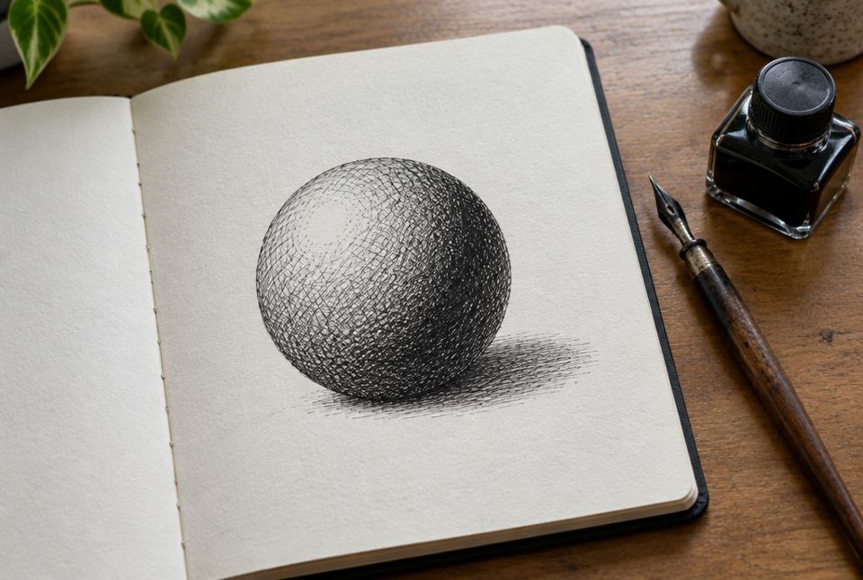 There is no grey ink here. Layers of crossing lines make the shadow side darker and give the sphere its round volume. AI-generated image
Building value with lines
- Hatching: parallel lines. Closer lines = darker.
- Cross-hatching: add another layer of lines at an angle. Each new direction makes it darker.
- Contour hatching: curve the lines to follow the form, like lines of latitude on a globe. This shows volume and direction.
- Pressure: pressing harder with a pencil or using a thicker pen makes lines darker.
Pen-and-ink artists, printmakers and engravers use hatching because their tools make only one colour: black. Value comes entirely from how many lines there are and how close they are.
Light on a form
When light shines on a round form like a ball, an apple or a face, you see a pattern of values:
- Highlight: the brightest spot.
- Light side: light values.
- Core shadow: the darkest band on the form, on the side turned away from the light.
- Reflected light: a slightly lighter edge inside the shadow, from light bouncing off the table.
- Cast shadow: the shadow on the table, darkest right under the object.
A smooth gradation from light to dark is what makes a circle look like a sphere. In Grade 8, aim for more steps of value and smoother changes.
Visual weight
Some shapes seem to pull the eye or feel heavier than others, even on a flat page. This is visual weight.
- Dark values feel heavier than light ones.
- Large shapes feel heavier than small ones.
- Strong contrast and detail add weight.
- Shapes higher on the page or near the edge can feel heavier or less stable.
So a large, light-coloured shape can feel about as heavy as a small, dark one. Artists use this to balance a composition without making both sides the same.
Gradation in size also matters: a row of shapes that gets gradually smaller suggests distance or movement, like a line of fence posts disappearing into a field.
Worked exampleExample: Solving a design challenge with value
Challenge: create a pen-and-ink drawing of a lighthouse at night for the cover of a mystery book. Audience: readers aged 10 to 14. Purpose: create mystery and suspense. You may only use a black pen.
- Value plan: make the night sky the darkest value with dense cross-hatching in four directions. Leave the beam of light as white paper.
- Gradation: the sky lightens slightly near the beam: four directions, then three, then two, then single hatching.
- Volume: use contour hatching that curves around the lighthouse tower so it looks round.
- Visual weight: place the small, dark lighthouse low on the left; balance it with the large, pale beam sweeping to the right.
- Communicate: strong contrast between black sky and white beam creates drama; the hidden, dark shoreline creates mystery for the audience.
Choosing value techniques on purpose solves the challenge: cross-hatching for darkness, gradation for glow, and visual weight for balance.
Worked exampleExample: Analysing value in a print
Let's analyse a black-and-white wood engraving (made-up) of a winter forest at dusk.
- Observe: the trees are drawn with tight cross-hatching, the snow is mostly white, and the sky has fine horizontal hatching that gets closer near the top.
- Analyse: the gradation in the sky (lighter near the horizon, darker at the top) suggests the last light of day. The dark trees against white snow create strong contrast.
- Visual weight: a single dark tree on the right balances a cluster of thinner, lighter trees on the left.
- Message: quiet, cold and calm, but with a sense that night is coming.
- Evaluate: the value choices work well for the mood; the strong contrast holds the eye.
Analysing value means connecting how lines create light and dark to the mood and message.
Tips for clean hatching
- Use a sharp pencil or a fine-tip pen, and turn your paper so your hand moves comfortably.
- Keep lines evenly spaced and in the same direction in one area.
- Build darkness slowly; you can't erase pen.
- Practise on scrap paper first.
Just for funWhy did the artist get in trouble at the drawing lesson?
She kept crossing the lines. (It's okay, it's called cross-hatching.)
Hands-on activityLine and value studio
You need: paper, a sharp pencil or fine black pen (ballpoint works), a ruler, a lamp or flashlight, and an apple, orange or ball.
- Value scale: draw six boxes in a row. Fill them from white to darkest using only lines, like the scale above.
- Observe light: put the fruit on white paper and shine a light from one side. Find the highlight, core shadow, reflected light and cast shadow.
- Hatched sphere: draw the fruit. Use contour hatching that curves around the form and cross-hatching for the shadows.
- Visual weight: cut one large circle from light paper and one small square from dark paper. Move them on a page until they feel balanced.
- Design challenge: make a pen-only book cover with a clear mood (mystery, calm, excitement). Use a full value range and visual weight to balance it.
- Analyse: write three sentences explaining how your values create the mood.
Your turn
How light or dark a colour or tone is.
2How do you make hatching look darker?
Put the lines closer together, add more directions (cross-hatching), or press harder or use a thicker line.
3What is the difference between a core shadow and a cast shadow?
The core shadow is the darkest part on the form itself; the cast shadow is thrown onto another surface.
4What is contour hatching, and why is it useful?
Hatching lines that curve to follow the form; they show volume and direction.
How much a shape seems to pull the eye or feel "heavy" in a composition.
6Can a small shape balance a large shape? Explain.
Yes. A small, dark (or high-contrast, detailed) shape can feel as heavy as a large, light shape.
7What does gradation mean in shading?
A gradual change from light to dark, which makes forms look 3D.
More practice: warm-up
1Parallel lines used for shading are called ___.
2Which is darker: lines far apart or close together?
3Where is the highlight on a ball?
The brightest spot, where light hits it most directly.
4True or false: dark shapes usually feel heavier than light shapes.
5Why do pen-and-ink artists use hatching?
Their pen makes only one colour (black), so they build value with lines.
More practice: on your own
1A light comes from the upper right. Where will the core shadow and cast shadow be on an apple?
The core shadow is on the lower left side of the apple; the cast shadow falls on the table to the left (away from the light).
2Plan a value scale with five steps using only lines.
Example: 1) white paper; 2) wide single hatching; 3) close hatching; 4) cross-hatching in two directions; 5) cross-hatching in three or four directions.
3A poster has a huge pale-yellow sun on the left and nothing on the right. It feels lopsided. Suggest a fix using visual weight.
Add a small, dark shape on the right, like a dark tree or bird silhouette; its dark value gives it enough visual weight to balance the large pale sun.
4Explain how gradation in size can suggest distance.
Shapes that get gradually smaller look like they are farther away, like fence posts disappearing across a field.
5Why might an artist leave the white of the paper for the brightest areas instead of drawing them?
The untouched paper is the lightest value possible, so it creates the strongest highlights and contrast.
Challenge
1Analyse how value could make a portrait drawing feel mysterious versus friendly.
Mysterious: most of the face in dark cross-hatching, with strong contrast and only one eye lit, perhaps lit from below. Friendly: mostly light values, soft gradation, gentle shadows, light from the front. Value controls what we see and how we feel.
2Design a composition with three shapes that is balanced but not symmetrical. Explain using visual weight.
Example: a large, light circle on the left; a medium grey square in the upper right; a small black triangle low on the right. The two smaller, darker shapes on the right together equal the visual weight of the big, pale circle. Look for reasoning about value, size and position.
3Your hatched sphere looks flat. Give three possible reasons and fixes.
- Not enough value range: add darker cross-hatching in the core shadow. 2) Straight lines that don't follow the form: use contour hatching. 3) No cast shadow or highlight: add both so the sphere sits on a surface and catches light. (Also: make the gradation smoother.)
Quiz
2. The darkest part of the shadow on a form is the ___.
3. Which makes hatching look darker?
4. A small, dark shape can balance ___.
5. Lines that curve to follow a form are called ___.
6. A smooth change from light to dark is called ___.
Big idea: For Grade 8, the curriculum's focus for value includes cross-hatching to suggest volume and shadows and increased gradation in values; for shape and form, various visual weights (large light forms can seem lighter than small dark forms) and gradation in size. Students use elements for an audience and purpose (D1.3), solve design challenges (D1.4) and analyse how elements communicate meaning (D2.2).
How to help:
- Shine a lamp on fruit and point out highlight, core shadow and cast shadow together.
- Look at the engraving-style lines on Canadian paper money, comic books or old book illustrations.
- Praise patience: good hatching is slow.
Common difficulties:
- Scribbly shading. Keep lines parallel and evenly spaced.
- Not dark enough. Encourage a full range, from white paper to very dark.
- Flat forms. Add contour hatching and a cast shadow.